
Visual communication is essential for businesses across the board. Over the past year, however, the need for visuals in healthcare communication has become more prominent. The healthcare industry can be complicated for patients to navigate. With the right visuals, including digital signage, patients will have a better experience.
But what is visual communication, and how can healthcare institutions use visuals to convey complex information?
We share the best practices for creating visuals as well as some visual communication examples in healthcare.
What is Visual Communication?
Visual communication is defined as the method of using visuals to convey information and messages that evoke some type of action. It marries communication and graphic design to educate and engage audiences while also relaying information in a clear and precise manner.
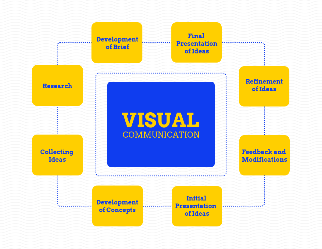
This mind map is a great example of how visual communication design works.
Why is Visual Communication Important in Healthcare
The pandemic has thrown into sharp contrast the discrepancy between who can and cannot access healthcare. Ensuring that patients and their families get the best information is now paramount. Here are three reasons why visual messages are necessary for communication in healthcare.
1. Use Visual Communication to Improve Workflow
The healthcare industry includes numerous systems and workflow processes for staff and patients. Making these processes easier to understand will be beneficial to everyone involved.
A patient interested in undergoing the procedure will have all the information they need just by following the instructions in the graphic.
For healthcare providers, using communication and design in this way will smoothen workflow and cut down on unnecessary admin work.
Using visual communication, healthcare practitioners can also set up better follow-up procedures. Healthcare organizations can create visuals of the follow-up process that staff can look at and understand at a glance.
2. Help Patients Transition with Visual Messages
Patients entering or exiting the healthcare system require a great deal of information. But a lot of health-related jargon can feel overwhelming for patients.
Using visuals makes the process easier and more effective. Nobody wants a patient to leave feeling confused about how and when to administer their medication, after all. Hospitals and clinics can avoid confusion by designing patient education materials like the example below.
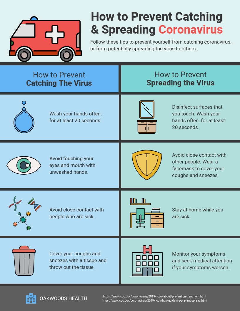
Visual communication and design like the above can also be displayed on digital signage within hospitals and clinics—this will increase the reach of the message and its effectiveness.
3. Provide Empathetic Care Using Visual Communication Design
Helping patients through the intake and checkout processes, and ensuring that they understand what next steps to follow, are crucial to showing patients empathy. Healthcare practitioners need to acknowledge that visiting the hospital or even a clinic can be terrifying for patients and their loved ones. Additionally, patients are often reluctant to question health authorities, even if they don’t understand what is expected of them.
Using visual communication to convey procedures and simplify jargon will ease patient concerns and improve their experience with the organization.
5 Best Practices for Healthcare Visual Communication
As necessary as visual communication is within the healthcare field, it can be daunting for practitioners and administrators to design effective visuals.
Here are a few best practices to follow when creating visuals that convey your messages.
1. Use Graphics to Tell a Story
The one defining factor of visual communication is that it relies heavily on graphics to tell a story. When creating visuals, don’t use too much text. If patients have to read the graphic, they may as well read a document. The point of the visual will be lost, in this case.
This goes for visual information and digital signage boards. Hospitals and clinics can be busy places—people don’t want to create a roadblock near signs because too many people are reading them at the same time.
Use graphic elements such as icons, images, and charts, to convey information, as this infographic example does.

2. Stick to the Facts
A long-winded visual can be as ineffective as a jargon-heavy document. Distill the information that needs to be shared to the most important facts. Use the headings and subheadings of a document to structure visual messages. Use icons to denote actions instead of writing a paragraph of text. The icons illustrate the points the graphic is trying to make, thus saving time and effort on the part of the reader.
3. Use Company Branding
Branding may not seem like the most important graphic element in visual communication but it does play a necessary role in healthcare, especially in the digital arena.
There is a great deal of miscommunication online. Facts are construed or misattributed, leading to people making incorrect assumptions or taking the wrong action. One of the best ways to ensure that patients, and anyone accessing patient education materials, knows they’re getting their information from the right source is by adding branding.
Logos, brand colors, fonts, and even the healthcare company’s tone of voice, should be incorporated in visual communication design. Digital signage can help with that, ensuring that content placed before viewers is all in line with an organization’s branding.
4. Visualize Healthcare Processes
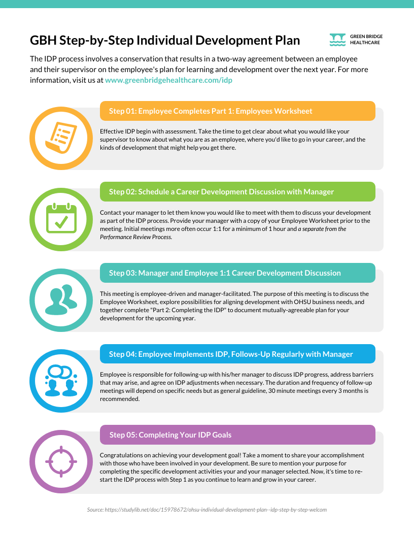
As we have mentioned, there are numerous processes involved in the healthcare system. Some of these processes are internal and known only to the staff.
However, even these internal steps can impact patients if they aren’t followed or conveyed correctly. Designing a process infographic for staff like the one below, whether for employee development, process management, or patient intake and checkout systems, makes internal communication more effective.
5. Humanize Content
The healthcare experience can be overwhelming for patients. Handing them documentation rife with jargon confuses them even more. Instead, healthcare institutions should humanize their visual communications. Simplify complex processes and data by using visuals like infographics and charts that are easy to understand.
Use imagery and diverse icons that reflect the multitudes of patients that the organization interacts with. This will help patients feel more connected with their institution.
Conclusion: Visual Communication Improves Patient Experiences in Healthcare
Visuals can be challenging to create for non-designers. But in the healthcare industry, it is a necessity.
So much complex information needs to be shared with patients who don’t often understand it. That is why visual communication is the most effective way to convey data and messages to patients.
We have shared the three reasons why visual communication design is necessary for healthcare, as well as best practices for incorporating visuals in documents.
With these tools in hand, institutions can begin implementing a more visual strategy right away.

This guest blog was written by Ronita Mohan, a content marketer at Venngage. Venngage is an online infographic maker and design platform. Ronita regularly writes about marketing, design, and small businesses. Twitter: @Venngage