A huge part of digital signage content design is its functionality. Does it communicate a coherent message to your viewers? With this in mind, the text of your message becomes extremely important. Typography can make or break your design. If no one can read your messages, what’s the point of displaying them in the first place? The good news is simple practices will keep the text of your campaigns readable and effective for as long as you use them.
The Best Practices for Typography in Digital Signage Content
The way your message looks is just as important as the information it conveys. Here are the best ways to ensure your visual messaging is eye-catching and easy to read.
Be Choosy with Your Typeface
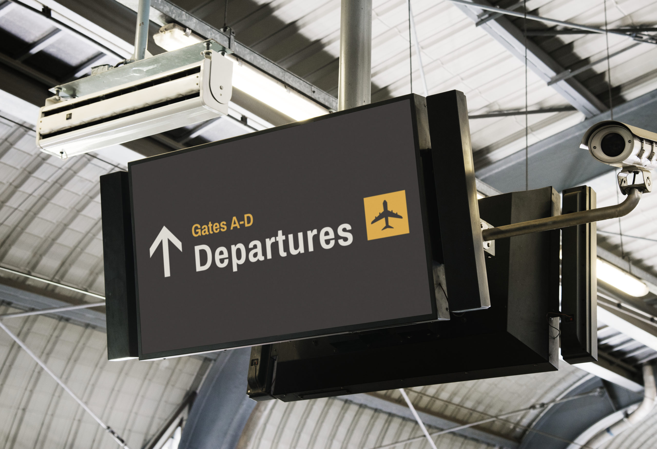
Unless you’re using a handheld smart device, your audiences are going to be viewing your signage from a distance. Usually 5-10 feet away. Because of this, you’ll want to consider the type of font used for your messages.
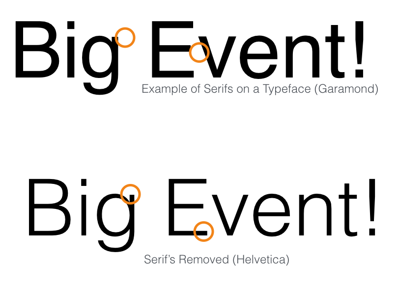
You need your text to stand out, not strain the eyes of the viewers. An easy to read sans-serif typeface will translate well in any setting. The most commonly used sans-serif typefaces for headlines are Arial (28%), Helvetica (20%) and Verdana (8%).
Per slide, try to limit texts to 2 or 3 different typefaces and styles. This means that the body should all be one font and size, but the title can be something more experimental- so long as it is readable! Don’t be afraid to make these fonts different from each other. Using 2 similar fonts can look like you made a mistake and chose the wrong font.
Size Matters for Digital Signage Content
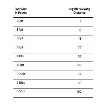
Just like typography, the size of the type plays a huge role in your messages’ readability. The further your screen will be from the audience, the larger you need to size your text. Lobby signs are usually positioned 10-15 feet away from viewers, but digital signs in data and call centers are usually 30-50 feet away. The chart below is a good reference point for type size to distance ratio for best readability.
Kill Off the Unnecessary Characters
Just like an HBO special, too many characters only causes confusion. The same rule applies to digital signage messages. The shorter the message, the easier it is for the audience to digest. Keeping your messages below 250 characters can get you 60% more engagement.
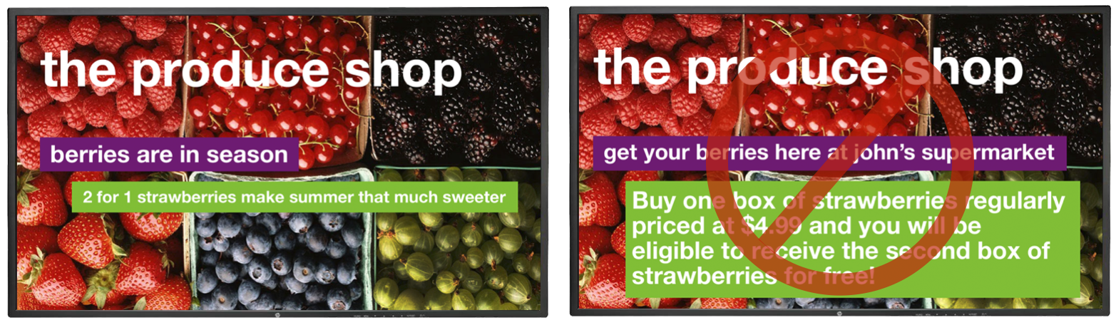
Remember, you only have about 3-6 seconds to capture their attention anyway. A paragraph of text will only divert their gaze. Bleak up longer messages up into multiple slides. Just be sure to keep those slides together! And try to keep characters limited to 55 to 85 per line.
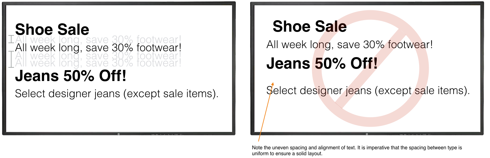
Alignment is Key
Spacing is important to any design. Cramming your text to one side, or to the top of the signage will look unprofessional. Text should never touch the outer perimeter of the screen or any images. The trick is to space out your lines of text inside of a mental margin while keeping the lines aligned. CommandCenterHD has horizontal and vertical guides to help process simple.
Implementing the Right Typography for Your Digital Signage Content
Messages are the main function of digital signage. If you keep them short and sweet and easy to read, your signage will always be on the right path. Stay tuned for more tips and information on how to utilize best practices for your digital signage content design, without needing the $100k graphic design degree.