Why is Data Visualization of Real-Time Metrics Important to Productivity?
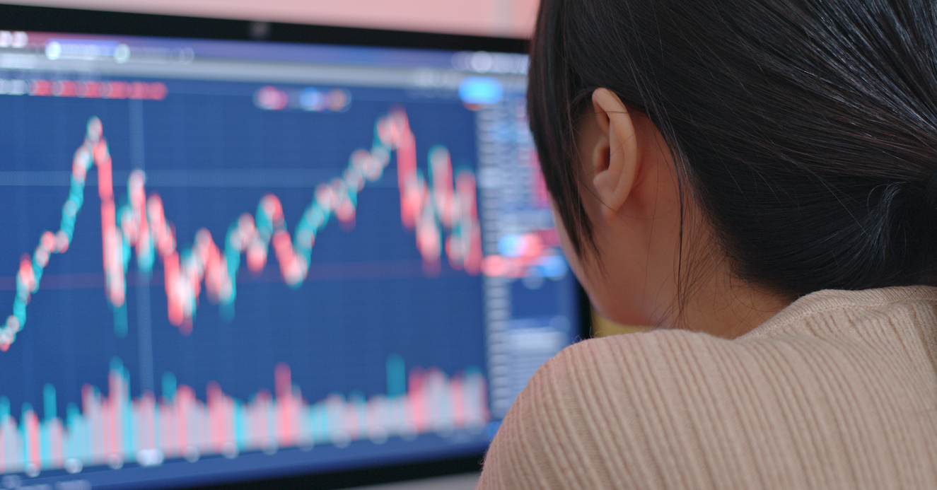
Currency, leads, conversion rates– business performance is a game of numbers. To stay ahead of the competition, it is vital to measuring those numbers daily. Organizations using platforms like Salesforce and HubSpot have the luxury of running reports with little to no grunt work. But communicating those reports via visual communication mediums, like digital signage, hasn’t been simple in the past.
Let’s be honest: the last thing anyone on staff wants to do is convert .csv files into graphs, then into content for digital signage, each day. Now users can automate data visualization with digital signage software.
Visual perception, handled by the visual cortex located in the rear of the brain, is extremely fast and efficient. We see immediately, with little effort. Thinking (i.e. cognition), handled primarily by the cerebral cortex in the front of the brain, is much slower and less efficient. Data visualization is effective because it shifts the balance between perception and cognition to take fuller advantage of the brain’s abilities.
Employees will usually glance over a report once a day to check their numbers; while super competitive employees might check them a few times. In both situations, the process disrupts their natural workflow. Instead of emailing a client or fully engaging them with a phone call, they’re fumbling around in a spreadsheet to see who has the most sales for the month. With data visualization, the numbers are displayed as easily-digestible images. Therefore, it takes no time for employees to check their progress reports.
Employee Progress Improves with Real-Time Metrics
Do you know that friend who always tells it like it is? The one who will give you tough love, but also offers that boost of encouragement and loves to congratulate you when everything goes right? The friend is automated data reporting.
Not all companies have access to a system that tracks their progress minute-by-minute (or even second-by-second). But many do, and the numbers are often tucked away, accessed by just a few people, many of whom aren’t the ones actually moving those digits.
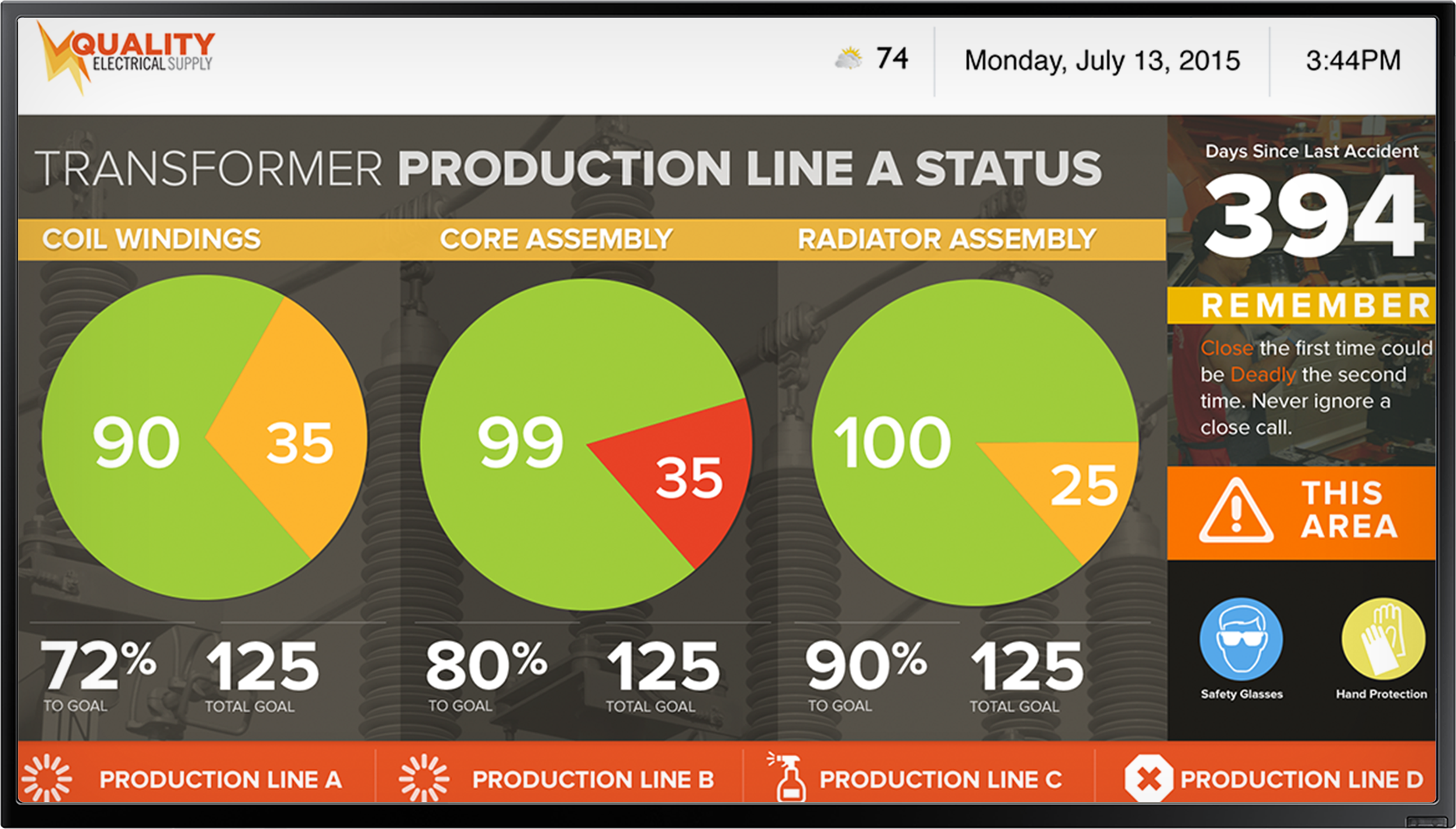
That was the case at Angiodynamics, where supervisors could easily monitor real-time numbers, but their employees were too busy working to check their larger team progress. The company’s manufacturing manager saw a real problem with that, and his instinct was in the right place.
Seeing those charts and figures — green when pacing well; yellow when doing okay; red when things are falling behind — is critical for supervisors, who are tasked with making sure everything stays on schedule. But what many managers don’t realize is that it’s just as important for the larger staff to see those up-to-date charts and figures, too. How can they display real-time reports to line workers?
Data Sources Are Digital Communication Gold Mines
Nowadays the answer is digital signage. Any electronic screen can become a communication outlet. Couple this with a centralized management platform and the entire workplace is suddenly able to view real-time metrics.
The beauty of digital signage technology its ability to integrate with databases that track each step of the manufacturing process. This information can be automated to the signs to keep everyone updated.
Digital signage is easily one of the fastest ways to communicate informational messaging to your audiences without email or paper. Production metrics, inventory management, statistics about product quality, worker-performance, machine performance, quota tracking, and business performance can be updated in real time and automated to the screens.
Employees Need to Monitor Performance Goals in Real-Time
Real-time metrics always play it straight, telling you exactly how much progress your team has made and what’s left to go. They’re a really good friend to have in the office, and not just for supervisors. We’d go ahead and argue that they’re a best friend for employees.
Why? Well, because as Angiodynamics explained to us, real-time metrics are the golden ticket for employees who (understandably!) want to go home and enjoy their free time out of the office. “The biggest question we get on the floor is, Why am I on overtime?’” Production Manager Lucas Sauer-Jones told us.
With the constantly-updating schedule metrics displayed via digital signage, “in real time, they start to see their schedule decrease, and once they get to zero they get to go home. It’s all in their control. It’s decreasing, and they get to go home earlier.”
This method also allows for extra transparency: Employees who don’t work the standard 9-to-5 become distrustful of their managers when they have no idea how long they’ll have to stay at work each day. With real-time metrics, they can get that impartial information so they always know exactly how much more work is to be done before they can clock out.
1. See the Bigger Picture
Long story short: Seeing the bigger picture is more effective than looking at numbers. This concept goes back centuries, with the invention of charts and graphs. When was the last time you saw a pie chart? Probably within the hour. We use pie charts and bar graphs all the time because they are universally understood. For a sales report: Jim has the biggest slice of pie = he’s made the most sales this month.
2. Notice Problem Areas
Data visualization can draw attention to problem areas faster than a spreadsheet. A bar chart or line graph is the perfect visual when numbers are reaching critical levels. A quick glance makes it obvious that improvements and changes must be made. When customer satisfaction survey responses are averaging at a 1 out of 10, the customer service department is due for an audit.
3. Track Behavior Changes
Over time, one campaign or product might outperform the others. Why? Well, with data visualization the trends should be easy to assess. Perhaps a social post went viral during the product launch, or the product was picked up by a brand advocate. October might have been a fluke for leads, but November made up for it. Noticing these ebbs and flows in business performance is much easier through data visualization
Digital Signage Data Integrations
Digital signage is a medium that is commonly used in organizations to display corporate messages and company-wide reminders. With simple software integrations, this visual tool can also transmit the data reports from platforms like Salesforce. Without adding any work to anyone’s plate, graphs and charts with sales and marketing data can adorn the signs with updated information multiple times a day.
Data visualization simplifies reporting for organizations. Taking the information employees need to see each day and automating it to a visual medium like digital signage is a sure way to keep the organization in check. Employees are able to see the broad picture of their performance, are alerted of problem areas, and can track trends over time.
Static reporting is getting left behind, and for good reason. It’s not accurate, it’s not motivating and it’s just not the way of 2019. We have the technology to know exactly how much progress has been made, and if you’re not already taking full advantage of that option, you’re taking it for granted — at your own disadvantage. Check out the Business Impact Workshop with Angiodynamics for the whole story.