One of the biggest advantages of using a digital directory is that it can easily be designed to fit your brand and effortlessly changed as needed. While the possibilities are nearly endless as far as what you can create, there are a few design principles you should keep in mind when designing a digital directory of your own.
If you incorporate each of these rules of thumb, you can be sure your digital directory will get customers and other visitors where they need to go with ease.
1. Choose an orientation that works for your space
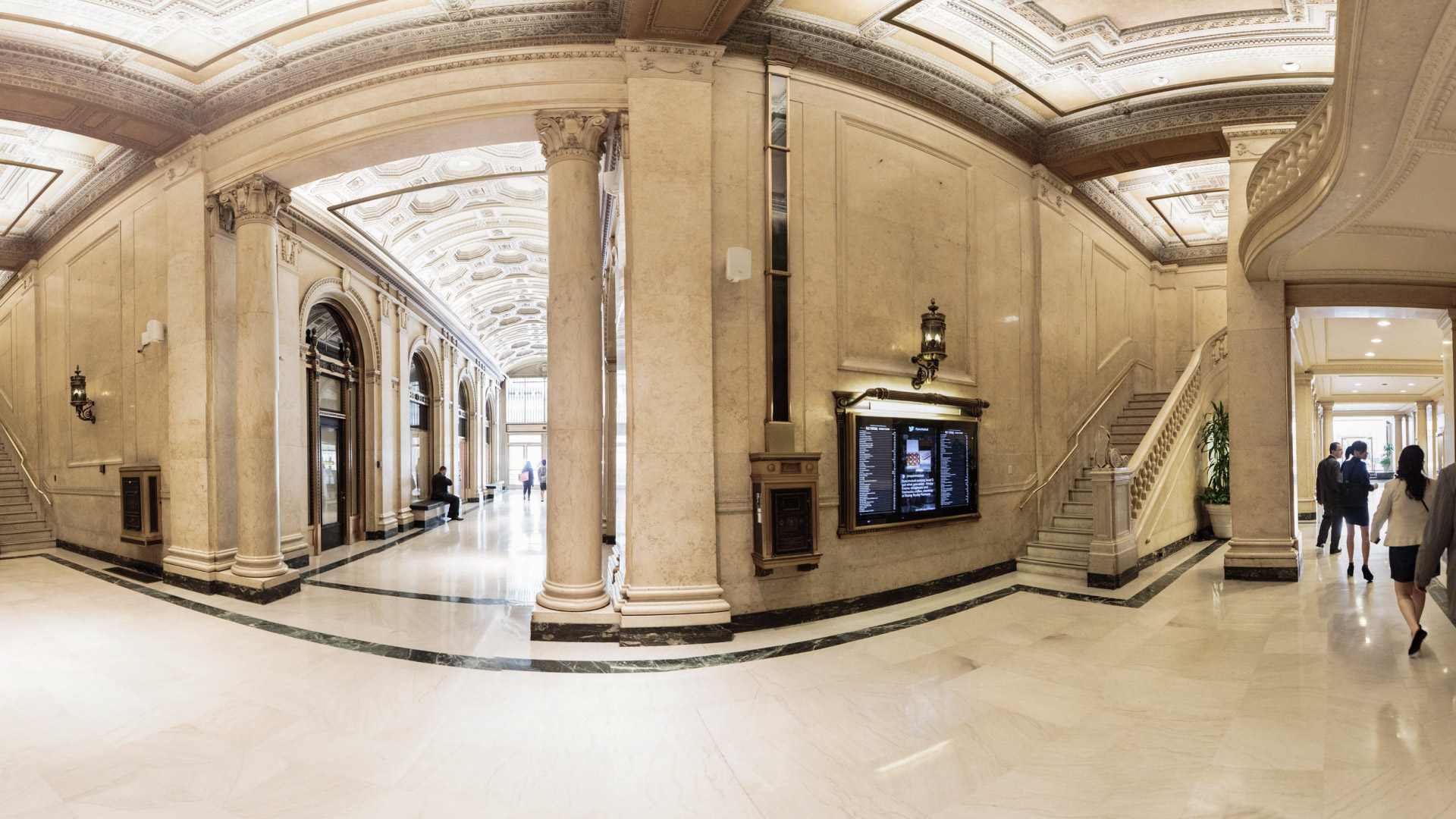
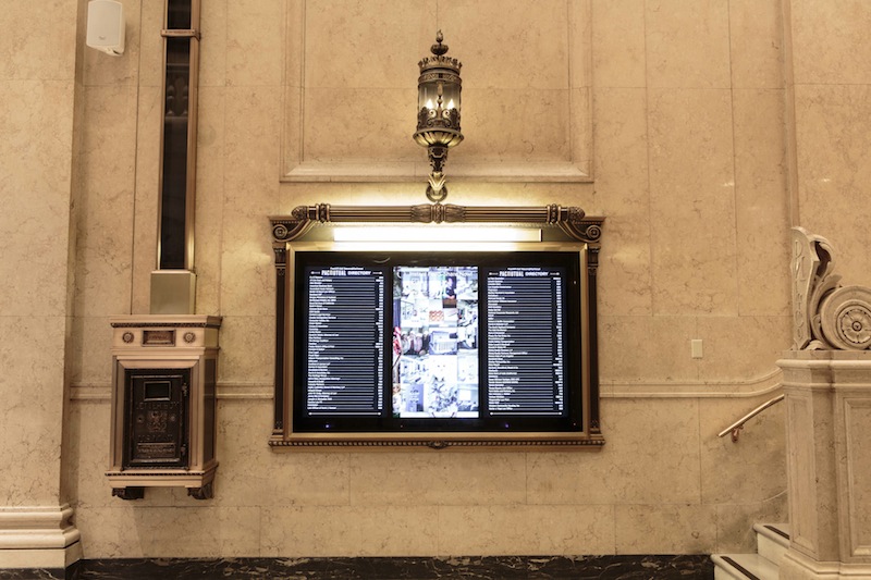
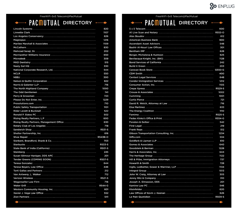
You can design a digital directory in landscape or portrait orientation. Which one you choose can depend on how many listings you have and where you want to hang your display. You may also want to consider whether you’ll hang multiple displays next to one another, like PacMutual did with their digital directory below.
2. Make it easy to read
It might seem like a given, but readability is the most important aspect of your digital directory and one of the more challenging parts of the design process. Your digital directory should be recognizable as one from a distance, which means you’ll need to use a large, bold display font at the top of the screen indicating its purpose.
Your digital directory should be recognizable as one from a distance.
People should be able to stand a few feet away from your display and read it without squinting, so make sure the listings themselves are in a legible font (sans serif fonts are ideal for screens) that’s big enough for those with less-than-perfect vision to read—somewhere in the 20-30 pt. range or bigger.
3. Keep in mind contrast, balance & white space
These design principles go hand-in-hand with readability but are also key elements of good design, period. Contrast can apply to different colors, fonts, object sizes and images and creates visual interest, especially in making important information stand out. Balance large chunks of text evenly across the screen and use white space where possible—especially in the margins—to avoid making your digital directory look too cluttered.
Contrast, balance and white space are key elements of good design, period.
Don’t worry if all your listings don’t fill up the entire screen—it’ll actually be easier to read and will allow you to play with balance more.
4. Use high-quality images
If you opt to use an image on your directory, make sure it’s high-resolution, bright, scaled properly and eye-catching. You can use an image to illustrate the layout of your building, the interiors of select rooms or business logos. Make sure to add enough padding around your images so text doesn’t jut up right next to them. And, of course, only use images you own the licenses to.
5. Keep it on-brand
The fonts, colors and overall theme that you use on your promotional materials and signage should be the same ones you use on your digital directory. If the digital directory is for one large office or business, you have more creative freedom to add elements of your brand to the directory. If your building houses a number of businesses, go with more all-purpose colors and fonts that fit the feel of the establishment itself.
6. Categorize and alphabetize your listings
The more listings you have on your digital directory, the greater your need for organization by category or alphabetization. If your building houses a number of tenants (like in a mall), divide the listings up into categories like apparel, food, kids, home and more. Within those categories, make your listings alphabetical. Make sure the categories are set off with a different font and color (contrast!) so the viewer is not overwhelmed by a sea of sameness.
7. A word of caution: don’t go crazy
…with the design, that is. While the possibilities are indeed endless, when it comes to effective design, form should always follow function. In other words, don’t get so creative that people have no idea that your digital directory is, in fact, a digital directory.
When it comes to effective design, form should always follow function.
Though traditional directories are practically begging for modern updates, they’ve been using the same standard layouts for decades for good reason. People know what a directory looks like, and they know how to read it—don’t create something so wildly different from a standard layout that they have to learn how to read it. (That will only defeat its purpose!)
Incorporating these design principles will guarantee a digital directory that’s both beautiful and functional. And if you want to change up the design, it’s easy (and free) to do.